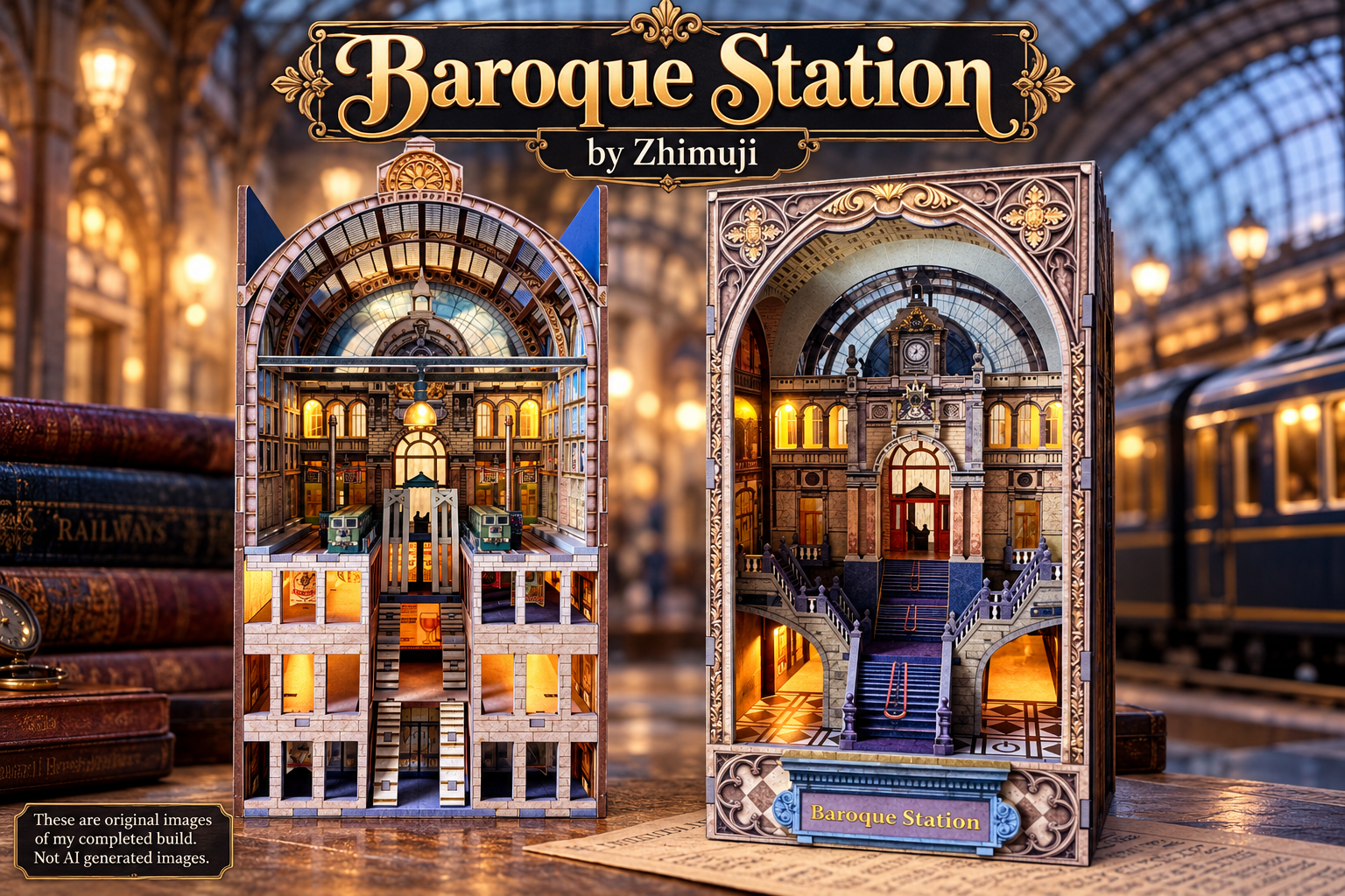
“A throwback to a more elegant time in history.“
Built and reviewed by: John A MacInnes. Build number 75, October 2026.
A Grand Entrance into the World of Book Nooks
Shortened review – 500 words.

Build 75 · Model ZAF01502 · 207 pieces · Recommended age 14+
If you enjoy book nooks with architectural grandeur, Zhimuji’s Baroque Station is worth considering. This 207-piece DIY kit creates an ornate railway-inspired scene, with decorative architecture, printed window panels and warm-white LED lighting. It offers something different from familiar miniature streets and shops, and that change of pace is part of its appeal. A welcome change from familiar designs.
The quality is apparent from the start. The printed MDF boards feature crisp, detailed artwork, and the six-colour HD printing advertised on the box looks impressive. The laser cutting is equally good: pieces release cleanly, many need no sanding, and there are no obvious burnt edges or untidy marks. Accurate cutting also means the components fit together well, with very little glue needed during assembly.
The 34-page instruction booklet is clearly illustrated and takes the builder through construction in a sensible order. Useful hints and tips help along the way, while the lighting setup is straightforward. Five warm-white LED heads illuminate the interior, and a touch sensor controls the lights. Test the lighting before fitting everything into the model; it is easier to sort out any problem while the components are accessible.
It is not completely trouble-free, so do not let the excellent fit elsewhere make you careless. C9 and C11 needed extra pressure to sit properly against C10, and the accordion-style D14 pieces on page 30 are particularly fragile. I broke two while shaping them, but fortunately the kit includes a spare. Take your time with these parts, follow the warnings and resist the temptation to force anything.
One pleasure of this build was how little extra work it demanded. Sanding was minimal, glue use was low, and I did not feel the need to add extra lighting, plants or other embellishments. The printed window details and acrylic pieces already look convincing, and additional effects might distract from the design rather than improve it. Knowing when to leave a kit alone is part of the enjoyment.
Once assembled, Baroque Station has real presence. Its elaborate architecture and layered construction create a grand miniature setting, while the warm lighting adds atmosphere without overwhelming the details. It feels more like a tiny architectural landmark than a simple room or street scene, giving the builder a different visual result from many conventional book nooks.
Overall, Zhimuji has produced a thoughtfully designed kit with excellent printing, clean cutting and satisfying component fit. The fragile D14 pieces need care, and a couple of joints may require patience, but these issues do not outweigh the strengths. The instructions are clear, the lighting is manageable, and the finished model looks impressive without modifications.
I have built enough nooks to appreciate when a kit makes the process enjoyable instead of turning every stage into a battle. Baroque Station achieves that balance: detailed and elegant, but generally straightforward to assemble. If you want a book nook with grand architectural character and a polished finish straight from the box, this is a very appealing project.
Full review – Introduction

This time, we’re heading somewhere rather more grand than your average street scene. Baroque Station by Zhimuji is the latest kit to land on my workbench, and if the name is anything to go by, we’re in for something with a little more architectural drama than your typical miniature shop or cosy little library.
Now, Baroque architecture is not exactly known for being shy and retiring. Think elaborate details, ornate decoration, sweeping curves and the sort of design that makes you wonder how anybody ever managed to build anything without first needing a lie-down. Add a railway station to that mix and you have the potential for a rather impressive miniature scene. Of course, the important word there is potential. We all know that what looks magnificent in the promotional pictures and what eventually emerges from a pile of wooden sheets, tiny components and a generous helping of glue can sometimes be two entirely different things.
Zhimuji is the manufacturer behind this particular kit, and I’m looking forward to seeing how they have approached the subject. Railway stations have always offered plenty of scope for miniature builders, with their architectural features, platforms, signage and the general sense of movement that makes them such interesting scenes to recreate. A station with a Baroque theme, though, gives us something a little different, and I’m particularly interested to see how the various details come together once the building starts to take shape.
As usual, I’ll be looking at more than just whether the finished model looks pretty sitting on a shelf. How well the kit is designed, the quality of the components, the clarity of the instructions and the general building experience all matter. And, of course, I’ll be keeping an eye open for those little opportunities to add my own touches along the way. After all, there is nothing quite like spotting a perfectly good detail that could be improved with a little customisation. My workbench has seen that particular problem often enough.
So, with Baroque Station now officially under construction, it’s time to get everything organised, have a proper look at what Zhimuji have supplied and find out whether this miniature railway station can deliver a first-class building experience — or whether we’ll be spending rather too much time waiting on the platform.
The inspiration behind the design

Zhimuji certainly hasn’t gone for anything understated with Baroque Station, and the illustrations on the box give us a pretty good idea of what they are aiming for. The company describes this as the “Railway Cathedral”, which is quite a grand title to give a book nook, but when you look at the ornate arches, elaborate decorative panels, towering clock and sweeping staircase, you can begin to understand where they are coming from.
The inspiration appears to be a combination of grand European railway architecture and the Baroque style, with its emphasis on elaborate ornamentation, dramatic details and buildings designed to make an impression.
A real-world comparison can be found at Luxembourg Central Railway Station, whose impressive interior features the very architectural details that make Baroque Station so appealing: an arched ceiling, large glazed windows and a prominent clock. The station’s monumental design, dating from the early 20th century, draws on the ornate Moselle Baroque style. These features demonstrate how historic European railway architecture combined practical purpose with grandeur, creating spaces that were as impressive as they were functional. It is easy to see the connection with Zhimuji’s interpretation, where arches, decorative detailing and the clock help recreate that same sense of occasion.
Railway stations have always had the potential to be impressive structures in their own right, particularly during the golden age of rail travel, when arriving at a major station could be an experience almost as memorable as the journey itself. This design takes that idea and gives it a distinctly theatrical twist.
The rear of the instruction manual adds a little more to the story, describing a place where time stands still, hidden between the pages of your favourite novels. It talks about warm golden light filtering through ornate arches, the clock tower watching over the station and the footsteps of travellers hurrying through its halls. There is also a rather romantic suggestion that this is a place of farewells and joyful reunions, where the atmosphere of a bygone age lingers long after the trains have departed.
It is an appealing concept, although I suspect the real challenge for Zhimuji is translating all that architectural grandeur into a miniature that works convincingly as a book nook. The front illustration certainly promises plenty of intricate detail, while the additional pictures on the packaging show that there is considerably more going on inside than the grand entrance alone might suggest.
What interests me most is the way the design combines the appearance of a traditional railway building with the book nook format. Rather than simply creating a scene viewed from the front, the illustrations suggest layers of architecture, arches and interior details that draw the eye deeper into the model. The lighting should also play an important part in bringing those details to life, particularly if it manages to recreate the warm, welcoming glow described in the manual.
Of course, promotional artwork has a habit of making everything look rather wonderful, so the proof will be in the building. Can Zhimuji deliver the intricate architectural detail promised on the box, and will the finished station capture that sense of scale and grandeur without becoming visually overwhelming? That is what I want to find out as the build progresses.
Unboxing

The first thing to establish is exactly what we are dealing with here. The box identifies this as Zhimuji’s Baroque Station, model ZAF01502, and describes it as a DIY book nook aimed at builders aged 14 and over. There are 207 pieces listed on the packaging, along with LED lighting, and the finished dimensions are given as 116mm wide, 151mm deep and 224mm high. That makes it a fairly substantial little scene in terms of height, and at over 22cm tall, it should certainly have a reasonable presence on the bookshelf.
Opening the box reveals eight full-size MDF boards, which is something of a welcome relief after wrestling with the 1.6mm plywood used in my previous build. There is nothing particularly wrong with thin plywood when it is used appropriately, but it can be a bit of a pain when you are dealing with delicate pieces that need to be removed, handled and fitted together without damage. MDF has a different feel to it, and I’m hoping these boards will provide a solid foundation for what looks to be a fairly intricate piece of architecture. Of course, the real test will come when I start removing the components and fitting them together, but first impressions are encouraging.
The lighting arrangement looks relatively straightforward, with five LED heads in warm white and a touch sensor fitted by mini JST connectors to a twin AAA battery box. There is no unnecessarily complicated lighting system to contend with at first glance, which is always welcome, and the warm-white LEDs should, in theory, give the interior a lovely glow. Given the station’s elaborate arches, decorative details and imposing entrance, the lighting could make a considerable difference to the finished appearance. It should help create that atmospheric, old-world feel described in the manual, although we will have to wait until everything is assembled to see how effectively the light reaches the various areas of the model.
For the windows and other transparent elements, Zhimuji have supplied two acetate sheets and a sheet of printed acrylic. These should provide the glazing and decorative effects needed to bring the architectural features together. Having different materials for these elements is interesting, and I’m particularly keen to see how the printed acrylic is used within the overall design. With a model like this, the windows are not simply holes to be filled; they are an important part of the finished appearance, helping to create the impression of a much larger building. I know I have stained glass acetatets in my stash, and it may well be they will be pressed into action.
There are also a few useful extras in the box, including tweezers, a screwdriver and some sandpaper. None of these is particularly exciting in itself, but they are practical additions for a kit involving small components and plenty of detailed work. The tweezers should prove useful when handling the fiddlier pieces, while the sandpaper may come in handy if any edges need a little tidying before assembly.
Sickers to hold wiring in place is also included, which should help organise the electrical connections during the build. Anything that makes the lighting installation easier is welcome, particularly when you are working with several LED heads and trying to keep the wiring neat enough that it doesn’t become a feature of the finished model in its own right.
Overall, the contents appear to provide the main ingredients needed to get Baroque Station underway, with the MDF boards forming the backbone of the structure, the transparent materials taking care of the windows and the five warm-white LED heads promising to illuminate the finished scene.
With everything unpacked and ready for a closer inspection, it is time to turn our attention to the instructions and the components themselves. The box promises 207 pieces and an elaborate miniature railway cathedral, so the next question is whether Zhimuji have made the journey from flat-packed MDF to Baroque grandeur as straightforward as possible.
The Instruction Manual

The instruction manual supplied with Baroque Station is an A5 booklet running to 34 pages, and on first inspection, it looks to be a pretty well thought-out guide to putting this little railway cathedral together. The illustrations are well drawn, with the various stages of construction clearly presented, and there are hints and tips dotted throughout to help builders with some of the trickier parts of the assembly. These little pointers can make a considerable difference, particularly when working with intricate components where getting something in the wrong order can cause unnecessary headaches later.
Most of the assembly illustrations are presented in greyscale, but Zhimuji have sensibly used colour to highlight the lighting arrangements. This makes it much easier to distinguish the wiring and lighting components from the surrounding structure, which is especially useful when trying to work out exactly where everything needs to go. There is little point providing a lighting system if the instructions then leave you scratching your head trying to figure out how it connects!
As I always do before starting a build, I have already checked the lighting and read through the instructions from beginning to end. I like to have a reasonable idea of what lies ahead before I start removing pieces from the MDF sheets, and this initial read-through suggests that Zhimuji have planned the assembly in a logical progression. That is encouraging, because with a design involving several layers of architecture, decorative features and internal details, the order in which things are assembled can be just as important as the quality of the components themselves.
One particularly welcome feature is that the manual specifically instructs you to function-test the lighting before installing it. This is something I regularly recommend to anyone building a kit with electrical components, and I am pleased to see Zhimuji making the same point. It takes very little time to connect the lights and check that everything works, but it can save an enormous amount of frustration later. There is nothing worse than spending hours assembling a model, carefully concealing the wiring and fitting all the decorative pieces, only to switch on the lights at the end and discover that nothing happens. At that point, finding the problem can involve dismantling work you thought was finished. Test the lights first, and save yourself the potential grief.
The opening pages also cover the practical information needed before assembly begins. There is a list of accessories, an explanation of the various symbols used throughout the instructions, and a reference showing the MDF sheets and their components. These might not be the most exciting pages in the booklet, but they are worth familiarising yourself with before reaching for the glue. And talking of glue the manual shows that a tube is supplied, but most builders now fully appreciate that if a kit is being air-shipped, no glue or batteries can be included. Knowing what each symbol means and where the required pieces can be found should help keep the build moving without too many interruptions to hunt through the instructions or search the workbench.
The actual construction begins on page 5, leaving the preceding pages to deal with the preliminary information. That seems a sensible arrangement, giving the builder an opportunity to get acquainted with the kit before the assembly work begins in earnest.
Overall, the manual makes a positive first impression. The diagrams appear clear, the lighting is highlighted in colour, and the additional hints and reference pages suggest that some thought has gone into helping the builder navigate the process. Of course, a manual can look perfectly straightforward when you are sitting comfortably reading it, and the real test comes when you have a handful of tiny components in front of you and are trying to work out which way round they should go. We will find out soon enough whether these instructions are as helpful at the workbench as they appear on paper.
The printed boards

Now, this is where Baroque Station starts to make a rather impressive first impression. The MDF boards are fully printed, and the quality of that printing is quite something. In fact, I would go as far as saying that this is some of the finest printing I have seen on a book nook kit, with a level of detail that comes remarkably close to photographic quality. The box proudly advertises six-colour HD printing, and having had a good look at the boards, I am certainly not going to argue with that claim.
Before we get carried away with the pretty pictures, though, let’s have a look at the boards themselves. The laser cutting appears to be excellent, with clean, well-defined edges and no obvious signs of excessive burning or scorching around the cut lines. That is always encouraging, because nobody wants to spend time cleaning up charred edges or dealing with pieces that need a considerable amount of attention before they can be used. The cuts look neat, and I am hopeful that the individual components will release from the sheets just as cleanly when I get to them.
The printing is equally impressive, and it is not simply a case of having attractive artwork. The colours and details sit neatly within the boundaries of the individual pieces, with no obvious bleeding, colour overspill or fuzzy edges. This is particularly important with a design as ornate as Baroque Station, where decorative patterns and architectural features need to be reproduced accurately. When the printing is this detailed, even a small amount of misalignment can become noticeable, so it is good to see everything looking so precise on the sheets.
What really stands out is the sheer amount of detail captured in the printed surfaces. With this design based around elaborate Baroque architecture, there is plenty of opportunity for things to go wrong. Intricate patterns, decorative mouldings, stonework and other architectural features all need to be reproduced accurately if the finished model is going to look convincing. Blurry printing or colours that lack definition would take away much of the impact, particularly when so much of the visual appeal depends on those elaborate details. Thankfully, Zhimuji appear to have got this very much right.
The printing has a remarkably crisp, lifelike appearance, and there is a depth to the detail that makes some of the surfaces look almost as though they have been photographed rather than printed onto MDF. That is quite an achievement, especially when you consider how much of the finished appearance of a kit like this depends on the printed components. Not every manufacturer manages to get this right, so it is refreshing to see a company putting this much effort into the presentation of its boards.
Of course, there is a difference between looking impressive while the pieces are still sitting neatly on their sheets and looking equally good once they have been removed, assembled and fitted together. I will be keeping a close eye on how the printed details line up during construction, particularly where separate pieces meet and where architectural features need to flow seamlessly from one section to another. For now, though, both the cutting and the printing are giving me plenty of reason to be optimistic.
There is another detail on the packaging that deserves a mention. Zhimuji describe the boards as eco-friendly, which is heartening to see. We are all becoming increasingly aware of the need to think about the materials we use and the waste we generate, so it is encouraging when manufacturers appear to be taking environmental considerations into account. I would need more information before making any claims about the precise environmental benefits of the materials used here, but it is certainly good to see the subject being acknowledged.
Taken as a whole, these boards look exceptionally promising. The laser cutting is clean, there is no obvious scorching, and the printing is both beautifully detailed and accurately contained within the individual components. If that quality carries through into the finished model, Baroque Station could be a real treat for anyone who appreciates fine architectural detail. I have not even started putting the pieces together yet, but Zhimuji have already given me plenty to be impressed by. Now, let’s see whether the construction lives up to the quality of the boards.
Lighting kit

The lighting supplied with Baroque Station is a fairly basic arrangement, consisting of five LED heads and a touch sensor for switching the lights on and off. There is nothing particularly complicated about the set-up, which should come as a relief to anyone who has ever found themselves wrestling with a lighting system that seems to have more wires than the rest of the kit has wooden parts.
One thing I do like is that the wiring is colour-coded, which should make it much easier to follow when it comes to installation. Anything that helps distinguish one connection from another is welcome, especially when you are trying to route the wires through the structure and keep everything tidy. It should also make it easier to identify which wire goes where when following the illustrations in the manual.
The five LED heads are warm white, which should suit the design nicely. With all those ornate arches and decorative features, the lighting has the potential to add a lovely glow to the interior and help bring the architectural details to life. It is a relatively simple arrangement, but sometimes that is all you need, provided the lights are positioned sensibly and do their job properly. We will find out during the build just how effectively Zhimuji have used them.
I did spot one small omission in the instructions, though. On page six, the illustration shows the lighting connector removed from the battery box ready for installation, but the accompanying instructions do not actually mention unplugging it. It is a minor detail, but one that could leave a less experienced builder wondering whether they have missed something. And, with all JST connectors, don’t go trying to pull them out with the cable, you’ll damage it. Using your fingers, get a nail just under the small lip and then wiggle it from side to side to remove it safely.
Personally, I will follow the illustration and disconnect the plug before starting the installation. It should make handling the wiring easier and more convenient while fitting the lighting into the structure, rather than having the battery box attached and potentially getting in the way. Naturally, I will reconnect everything when required, but it seems the sensible approach to take.
As always, I have checked that the lighting works before starting the build, and I would strongly recommend that anyone assembling this kit does the same. It is a simple precaution that can save a great deal of frustration if a connection or LED turns out to be faulty.
Overall, there is nothing particularly intimidating about the lighting system supplied with Baroque Station. The five-head arrangement is straightforward, the touch sensor provides convenient control, and the colour-coded wiring should help make installation relatively painless. There is that small omission in the manual to be aware of, but it is hardly a major concern. The real test will be how neatly everything can be installed and whether those five little lights manage to do justice to Zhimuji’s rather grand architectural design.
The build

Well, I have to say, Zhimuji are making a very good impression so far, and the build itself is doing nothing to spoil that. I am currently at page 14, section 20 of the instructions, and up to this point, the whole process has been refreshingly straightforward. More importantly, the quality of the manufacturing is proving to be every bit as good as those printed boards suggested it would be.
The laser cutting, in particular, deserves a mention. I am genuinely amazed by just how cleanly the components have been cut, with pieces releasing from the MDF sheets without any fuss. Better still, some of them require absolutely no sanding whatsoever, with no burrs, nubs or rough edges needing attention before assembly. That is not something I take for granted when building these kits, and it speaks volumes about the standard of the manufacturing process. When the components come away cleanly and are ready to use, it makes the whole experience considerably more enjoyable.
There is something rather satisfying about being able to remove a piece, check it over and get straight on with the next stage, rather than having to spend time cleaning up every attachment point before you can even think about assembly. Of course, there may be the occasional piece that needs a little attention as the build progresses, but so far, I have encountered very little to complain about. Everything is releasing well from the boards, and the components are fitting together without giving me any significant headaches.
The instructions have also been easy to follow. I have been able to work through the various stages in the order provided, with the construction progressing logically and without any obvious confusion over what needs to go where. That might sound like a fairly basic expectation, but anyone who has built a few book nooks will know that it is not always quite so straightforward. Sometimes a kit can have you looking three pages ahead, trying to work out why you are assembling something that appears to serve no obvious purpose, only to discover later that you have missed a crucial detail. Thankfully, Baroque Station has been behaving itself rather well.
I am particularly pleased with how little corrective work has been needed so far. Between the clean laser cutting, the excellent printed surfaces and the clear instructions, this is shaping up to be one of those builds where you can concentrate on the actual enjoyment of putting the model together, rather than constantly having to compensate for shortcomings in the kit itself.
And that, I think, is worth celebrating. Finding a kit that progresses this smoothly, with so few issues to report at this stage, is a genuine delight. I might even reward myself with an extra coffee. Perhaps I will go completely overboard and open the biscuit tin as well. Now, that really would be an occasion worth marking.
Of course, I am only at page 14, section 20, so there is still plenty of construction ahead, and I am not going to tempt fate by declaring the entire build trouble-free just yet. There are more architectural details to assemble, lighting to accommodate and plenty of opportunities for something to trip me up. But if Zhimuji can maintain this standard throughout the remaining stages, then Baroque Station is off to a cracking start.
For now, though, I am happy to report that the build is progressing exactly as I would hope. The components are clean, the cutting is excellent, the instructions are easy to follow and, most importantly, I am enjoying the process. Long may it continue. I have a feeling that biscuit tin might be getting another outing before this one is finished.
First Tip of the Day

I did encounter a little bit of stubbornness when fitting parts C9 and C11 into the notches on part F12. These should be relatively straightforward fits, but for some reason, I just couldn’t get them to sit properly, leaving them refusing to sit flush against C10, the poster at the top of the stairs.
Naturally, I did what any sensible builder would do. I took them out, checked everything over, convinced myself there was nothing wrong, and popped them back in again. Nope. Still not sitting flush. Out they came for a second time, followed by another inspection, before I tried fitting them again. Still no joy.
At this point, I was beginning to wonder what on earth I was missing, because everything appeared to be correct. So, having exhausted my options for staring at the parts and hoping they would somehow see sense, I turned the model up to get a little more thumb pressure behind the fitting. And guess what? In they popped with a rather satisfying click!
Sometimes, it seems, all a stubborn component needs is a bit of convincing. The important thing is that I checked the fit several times before applying any extra pressure, rather than simply forcing the pieces together blindly. With everything now sitting correctly against the poster, I could get on with the build without any further drama. Still, those two little parts certainly made me work for my satisfaction!
Tip number two: Keep your acrylic pens handy!

From page 16 onwards, Baroque Station starts to grow upwards, and this is where a little preparation can save you some frustration later.
If, like me, you are firmly attached to your acrylic pens and insist on colouring all the exposed edges and tenons, you will need to do a bit of page-hopping as you go along. The trick is to check the printed colour of each component before deciding which pen to use on its edges and tenons. That may mean flicking backwards through the instructions, checking the relevant part, then returning to the page you are working on. It is not exactly the most efficient way of doing things, and you might find yourself wishing the manual gave you a handy colour reference for every component.
However, I can assure you that the extra effort is well worth it. Those exposed MDF edges and tenons can stand out like a sore thumb against beautifully printed surfaces, particularly on a kit where the printing quality is this good. Taking the time to colour them helps everything blend together far more convincingly and gives the finished model a much more polished appearance.
Yes, it is a bit of a faff, but we builders do tend to create extra work for ourselves in the pursuit of a better finish. So, keep those acrylic pens within easy reach, take a moment to check the colours, and remember that a little patience now can make a noticeable difference to the finished result.
Is this build truly a first for me?

Well, this has been a first for me in more ways than one. In fact, Baroque Station is threatening to turn everything I thought I knew about book nook building on its head.
For starters, this is the first kit I can remember where I have removed pieces from the boards without needing to sand all of them. No cleaning up the attachment points, no dealing with little burrs, before I can get on with the actual build. The laser cutting has been that good.
Then there’s the glue situation. I have used so little of it that I’m beginning to wonder whether Zhimuji have secretly developed a new form of MDF that holds itself together through sheer determination. The components fit so well that there has been very little need to compensate for anything, and the whole assembly process has been remarkably straightforward.
But perhaps the biggest first of all is that, as I write these notes, I have reached page 26 of a 34-page instruction manual and have hardly anything to complain about. Now, for anyone who has followed my previous reviews, you will appreciate just how unusual that is. There is normally something to grumble about, whether it’s a stubborn component, a questionable design decision, a piece that needs a bit of fettling or instructions that leave me wondering what the designer was thinking.
Not this time. So far, Baroque Station has behaved itself rather beautifully, and I am genuinely enjoying the experience.
The downside, of course, is that I am rapidly running out of material for the review. At this rate, I may have to abandon my usual search for things to moan about and concentrate on telling you how well everything works. Whatever next? A book nook build that goes together as intended, without requiring a small engineering workshop, a dozen extra tools and the patience of a saint?
There are still eight pages to go, so I am not tempting fate just yet. Plenty of time for something to go spectacularly wrong, although I sincerely hope it doesn’t. If the remaining stages are as trouble-free as everything that has gone before, this could turn out to be one of the shortest reviews I have ever written, and one that will move straight into that hallowed number of 100/100.
And honestly, if the biggest criticism I can make of a kit is that it has given me too little to complain about, I reckon Zhimuji are doing something very right.
Customisation

Now, this is going to be a rather short section, and for once, that is not because I have run out of ideas. It is because, quite honestly, I haven’t found anything that needs improving or adding to Baroque Station. That is a very unusual position for me to be in, as my customisation nose normally starts twitching before I have even finished reading the instruction manual.
Initially, I did consider adding some stained-glass effects to the windows. It seemed like a reasonable idea for a building of this architectural style, and it could have been an opportunity to introduce a little extra colour. However, when I looked more closely at the printed inserts and the quality of the acrylic components, I started to question why I would want to cover them up. The printing is so good that adding something extra would arguably detract from the design rather than improve it. Sometimes, you just have to recognise when the manufacturer has got things right and leave well enough alone.
I also resisted the temptation to add extra lighting. I ran a test in the evening, with the room lights down, and the supplied five-head LED arrangement seemed to illuminate the interior exactly as the designers intended. But was this enough? The warm glow brought out the architectural details beautifully, creating the atmosphere I think the kit was designed to achieve. So, who was I to interfere with that? Adding more LEDs could have risked spoiling a lighting arrangement that already works well. However, the more I looked at it from various angles I came to realise that some parts of the build were hidden in shadow, and would have benefitted from perhaps two more LED heads.
There was no need to introduce extra greenery either. The kit doesn’t include plants, but that isn’t a shortcoming that needs correcting. This is an ornate architectural scene, and adding foliage just because I usually like to include a little extra detail would have served no useful purpose.
And that, in a nutshell, is the story of my customisation efforts for Baroque Station. Nothing added, nothing altered and nothing felt overly necessary. I bought a kit designed to recreate a grand, Baroque-inspired railway interior, and that is precisely what Zhimuji have delivered.
Sometimes, customisation is about improving a kit, adding realism or putting your own stamp on a scene. But occasionally, you come across a design where the manufacturer has already got the balance right. In those circumstances, knowing when to put the tools down is just as important as knowing what to add.
So, for once, my extra LEDs and assorted bits and pieces can stay in their drawers. Baroque Station doesn’t need me to embellish it. It simply needs to be assembled as intended, and that is exactly what I have done.
Just when it was all going so well!

Well, we all knew it was too good to be true, didn’t we? Here I was, merrily sailing through Baroque Station, barely a complaint to my name, and beginning to wonder whether Zhimuji had finally produced a kit that was going to let me finish a build without something going spectacularly wrong. Then, with just a few pages left in the manual, disaster struck.
Page 30, part D14. Remember that one, because I certainly will.
D14 is an accordion-style component, and you need two of them to form the upper sections of the archways on either side of the build, effectively closing in the structure. Now, accordion pieces are nothing new to anyone who has built a few miniature kits. They are designed to bend and follow a particular shape, but there is always a limit to how far you can persuade them to go before they decide they have had quite enough of your nonsense.
Unfortunately, I managed to find that limit. Twice.
Yes, I broke TWO of them. Just as I was on the finishing straight, after an almost ridiculously trouble-free build, I suddenly found myself dealing with broken components and questioning my ability to put a simple piece of miniature architecture together. Thankfully, Zhimuji have provided a spare, which was a very welcome discovery. Without that, I would have been facing a rather awkward problem so close to the finish line.
So, here is my warning to anyone building Baroque Station: be very careful when fitting these pieces. And when I say very careful, I really do mean VERY careful. They will only bend so far, and if you try to force them beyond that point, they can – and will – snap. Take your time, work slowly and gently encourage the piece into position rather than trying to make it conform in one movement.
I have seen all sorts of advice over the years for dealing with accordion-style components, from soaking them in water to holding them over the steam from a kettle in the hope of making them more flexible. Personally, I have never found these tricks particularly helpful, and I am not about to start recommending them here. My preferred approach has always been patience and a gentle touch, allowing the material to bend gradually rather than attempting to persuade it through brute force.
The irony is that I knew perfectly well how delicate these pieces could be. I have encountered similar components in many other kits, and I understand the importance of taking care when fitting them. Yet somehow, in the excitement of being so close to completing a build that had given me practically nothing to moan about, I managed to forget two of the most important rules of miniature building: patience and care.
Why I didn’t follow my own advice in the first place remains something of a mystery. Perhaps I was getting carried away with the prospect of finishing a kit without any significant problems. Whatever the reason, D14 certainly brought me back down to earth with a bump.
Thankfully, the spare came to the rescue, and the build could continue. But if you are tackling Baroque Station yourself, please learn from my mistakes rather than repeating them. Those accordion pieces are delicate, the bends have their limits, and no amount of enthusiasm will persuade them to do something they are not designed to do.
And that’s why the instruction manual has printed a warning in red, that this part is “prone to breaking.”
After everything else had gone so smoothly, it seems only fitting that the kit should save its biggest lesson for the final stages. Zhimuji may have given me an almost perfect building experience, but D14 has ensured I won’t be forgetting this one in a hurry!
The final stage – sides and roof.

Having been caught out by the accordion pieces on page 30, you can imagine my reaction when I turned to page 31 and spotted another red warning in the instructions. This time, it concerned the printed PET section that bridges the two side panels and forms part of the roof. Now, normally, I would approach this with a reasonable degree of confidence, but after breaking two of the previous components, I was taking absolutely no chances!
This PET section needs to flex and bend to create the arched central roof, so there is clearly a limit to how much pressure you want to apply. I took my time, carefully checking the alignment and making sure everything was sitting where it should before attempting to fit it into position. The last thing I wanted was to reach the final page of the instructions only to discover that I had managed to break another component within sight of the finishing line.
Thankfully, this time around, a little patience paid off. Provided all the components are correctly aligned, the PET section should fit into place without too much difficulty. The important thing is not to rush it or try to force the curve into position when something isn’t lining up properly. Take a moment to check everything, make any necessary adjustments, and then proceed carefully.
With everything correctly positioned, all the tenons slipped into their respective mortises without any trouble, and the roof section came together as intended. After the earlier drama with the accordion pieces, that was a very welcome result!
And with that, Baroque Station was complete. Despite my little mishap on page 30, the final stages came together nicely, and the roof provides a satisfying conclusion to what has been an exceptionally smooth build overall. Zhimuji have clearly put a great deal of thought into the design, and once everything is assembled, you can appreciate how the various architectural elements work together to create the finished scene.
So, a final word of advice: respect those red warnings in the manual, take your time with anything that needs to bend, and never assume that because the previous 29 pages have gone swimmingly, the last few are going to let you off the hook. Trust me, I learned that one the hard way!
My Thoughts

Baroque Station has been a rather pleasant surprise, and I mean that in the best possible way. There are kits you choose because the finished scene looks attractive, and there are others that win you over through the sheer pleasure of putting them together. This one managed to do both, although perhaps not quite in the way I expected.
What impressed me most was the quality of the components. The printed MDF is excellent, the laser cutting is remarkably clean, and the accuracy of the parts makes a real difference when assembling something with so many layers and decorative details. I’ve built plenty of nooks by now, so I’m not easily impressed by a sheet of MDF, but Zhimuji has clearly put a great deal of thought into how this one goes together.
That doesn’t mean you can switch your brain off and let the instructions do all the work. The two fragile D14 pieces on page 30 certainly put paid to that idea! They need a gentle touch and a bit of patience, and I was grateful for the spare supplied in the kit. The slight wrestling match with C9 and C11 was another reminder that even a well-engineered kit can have the odd moment when a part needs a little more persuasion than expected.
Those moments, however, were very much the exception rather than the rule. The overall fit was excellent, sanding was barely necessary, and I used surprisingly little glue. The instructions were clear, the lighting was straightforward to install, and the finished structure came together without the sort of running battle that can turn an enjoyable build into an endurance test.
Visually, Baroque Station has plenty going for it. The ornate architecture gives the scene a sense of grandeur, while the layered construction and lighting help bring the interior to life. This is a miniature architectural statement, rather than simply another room tucked between two bookends, and it succeeds in delivering the look its designers intended.
I also found myself resisting the temptation to add my own touches. That doesn’t happen with every kit, but here the printed details and lighting already do the job they were designed to do. Adding more for the sake of it would risk taking something away from the finished scene rather than improving it. Sometimes, knowing when to leave a kit alone is just as important as knowing what to add.
Overall, Baroque Station left me with very little to grumble about, which is slightly inconvenient when you’re trying to write an honest review! I’m sure I could have spent another hour looking for something to moan about, but that would hardly be fair to Zhimuji. A kit doesn’t need to be difficult to build to be satisfying, and this one demonstrates how good design, quality materials and well-considered details can make the building experience enjoyable from start to finish.
But there is a distinction worth making between recognising an excellent kit and falling head over heels for the finished scene. So, after all that praise, did Baroque Station set the heather alight? In a word, no. And that’s not a criticism of the kit, but simply a reflection of my personal tastes. I like a book nook with a story to tell, preferably a street scene packed with little details to explore or one with a landscape backdrop that draws you into another world. Architecture, however impressive, doesn’t quite ‘float my boat’ in the same way.
That’s the beauty of this hobby: we all look for different things in a kit. My personal preferences don’t take anything away from the plaudits Baroque Station has earned throughout this review. The quality of the materials, the precision of the cutting, the fit of the pieces and the overall building experience deserve every bit of praise I’ve given them. It may not be the sort of scene I’d normally gravitate towards, but I can still recognise an excellent kit when I build one.
See the finished build in motion
Here’s the bit some like to skip straight to before then going back for a read of the review.
View our gallery of build images:
Click on images to enlarge.


Leave a Reply